
What happened? The change point analysis will tell you!
Written by Vincent Béchard and Martin Carignan
Relevant questions, imperfect tools
The questions we try to answer when we look at historical process data or a key performance indicator (KPI) are: did a change occur? Did more than one change occur? When? What was their amplitude? How confident are we it is a "real" change? In fact, what we are looking for is a change (or several changes) in the mean of a process.
Typically, some people will look at their historical data on a run chart and subjectively try to identify trends. This approach often leads to identifying many trends that are not "real". For example, some people will consider seeing three points in a row increasing as a signal of a trend up while we know that this situation could happen quite often just by chance.
Others will use a statistical tool, like the ImR, EWMA and CUSUM control charts. Unfortunately, control charts were not invented to identify changes in historical data but rather to monitor a process and allow separating between normal and assignable causes variation. Using a control chart with the objective of identifying changes in historical data is better than just using a run chart but it is not the most effective tool.
The Change Point Analysis
An efficient tool to identify changes in historical data is change point analysis (CPA). CPA is a procedure aiming at detecting any change in the mean of a process. It is intended to be applied on a "long" period of historical data.
The CPA procedure is a mixture of two powerful tools: CUSUM and bootstrapping. It is an iterative algorithm that decomposes the dataset into stable sub-periods having different means. For each change in mean detected in the process data, CPA returns a p-value: the probability of being wrong if we conclude that the identified shift is "real".
An example
Let's consider the historical yield of a process (see Figure 1). The data have been collected between January 2003 and May 2005. Classical questions are: What happened during this period? Did the yield change? Did we experience good and bad periods? Using a conventional ImR chart, with control limits at ± 3σ, the Western Electric rules would detect a special cause on November 2004 (4 out of 5 points in zone B or beyond). Even with this information, is it really clear when the yield really changed? By how much? With what confidence?
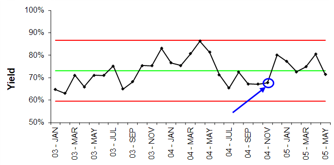
Figure 1 - Yield data on an ImR chart
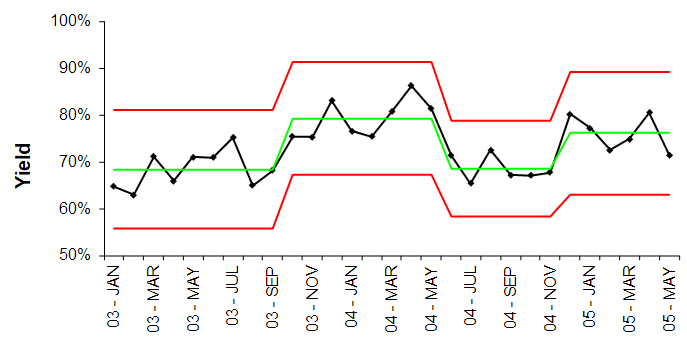
Figure 2 - Yield data after change point analysis
| Change point | p-value | Shift in the mean |
|---|---|---|
| 1 | 0.000 | +10.8% |
| 2 | 0.003 | -10.6% |
| 3 | 0.018 | +8.5% |
Using the CPA algorithm, we found out that 3 changes occurred (see Table 1). The results are 4 different stable periods, as illustrated below (see Figure 2). You can surely notice that the changes in yield are identified very clearly with CPA compared to the ImR chart. We also have a good idea when the change in mean did take place and the magnitude of the change.
Want to learn more?
There is no doubt about the usefulness of investigating historical data of a process or performance indicator. The change point analysis (CPA) is a powerful retrospective analysis tool. It provides easy-to-interpret results leading to better decision making. You can try the CPA using our Excel add-in
At Différence, our core expertise is centered on statistic and data science, Lean applications and operational excellence, and simulation! Don’t hesitate to ask for more information by contacting us.